Many people will dismiss the need for strict guidelines around club colors and logo usage as “no big deal,” but it really is a big deal when you consider the image you’re projecting to your teams and in your community as you are trying to grow your program.
Just visualize how the little guys feel when they are wearing the same gear and colors as their high school heroes. They feel like they are part of something awesome! Over time, your branding builds tremendous loyalty and is how people identify each other as members of the same “tribe” — people who LOVE lacrosse and support each others’ kids across every part of your program.
WARNING: Not having a policy about colors and logo usage is an open door to total mayhem, and you’ll all look sloppy and unorganized. And if you do not go with a professional graphic designer, you will regret it every day until you eventually hire one and get it done. A professional doesn’t get their feelings hurt when their designs aren’t right either.
Choosing your club colors
Do not reinvent the wheel! Always go with your high school’s colors (if possible) and keep your logo and uniform colors the same for the entire club, all ages, boys and girls. Colors play a major role in branding and subconsciously bond your community together.
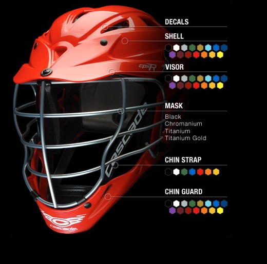
Because lacrosse helmets only come in a limited set of colors, it’s a good idea to choose your club’s colors within these parameters.
If you don’t, you’ll end up with helmets that don’t match your uniforms. (Yuck! Have you ever seen a team that doesn’t quite match? It always looks like a mistake.)
Hire a professional graphic designer to create your logo
When you begin to order any kind gear for the club, the first requirement will always be a professionally formatted logo in high resolution.
When you hire a professional, this is what you can expect:
- You will receive several options from your designer to choose from and be allowed a specific number of revisions
- You should be quoted a flat fee for the design process, not an hourly rate
- You will receive your finished logo in a full set of file formats that should include .pdf, .jpg, .eps and sometimes more. The .eps format is the universal standard and is required for professional printing of any kind – for stickers, clothing, banners, posters, embroidery machines, etc.
- Your finished logo will be delivered in high-resolution in at least 300 dpi, which basically means it’s ready for print. (If you were to open a hi-res image on your own computer, it would be gigantic. That’s what you want!)
- Your finished logo should be delivered in both color and black & white
- If you can get the logo donated, great! As long as the designer is a true professional graphic designer. You could offer the designer a sponsorship in exchange for the design and feature them on your club website. Remember that you get what you pay for!
TIP: A good way to find a professional designer is to identify other great logos you’ve seen around town and find out who designed them. Staying local also helps build your brand and has a built-in level of accountability. (This is also true for ordering uniforms, gear, and spirit wear. Keep this in mind – a vendor who your parents and players see around town and know personally is much more likely to go above and beyond to deliver your items and care about your happiness.)
Tips for planning your logo and brand
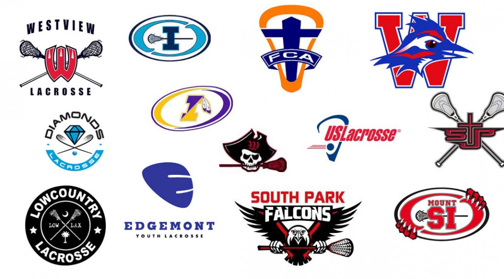
- Form a small committee of 2-3 people with varied backgrounds. Have each member of the committee independently go to Google Images and search for lacrosse logos. Print out a few that you like and try to identify WHY you like them.
- Stick to the simple designs! Anything that is complicated will really limit the gear you are able to create.
- Get together and choose a few concepts that you really like. This will get your designer going in the right direction and save a lot of time.
- The logo must look good when it is tiny and when it’s enormous. Think about a tiny helmet sticker, and a huge banner. Can you visualize the logo looking good in both scenarios?
- If you take the words away from the logo, can it stand alone? You want the design to be flexible enough to look great with words or without.
- Does it look good in both color and black & white? At times, you’ll need to print the logo in B&W and you should consider this as you plan.
- Be forewarned – using images of players, helmets and lacrosse sticks are difficult to include in logo designs. It can be done, but it’s tricky.
Think ahead and visualize
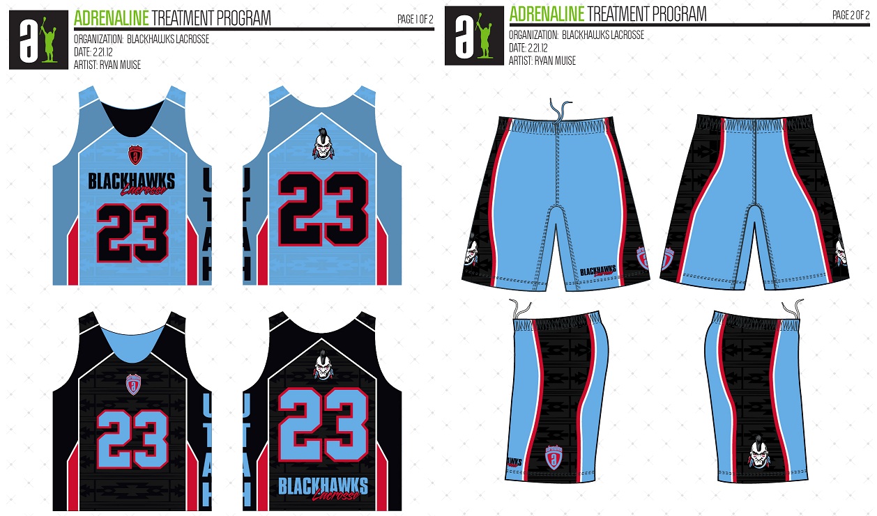
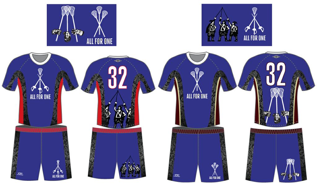
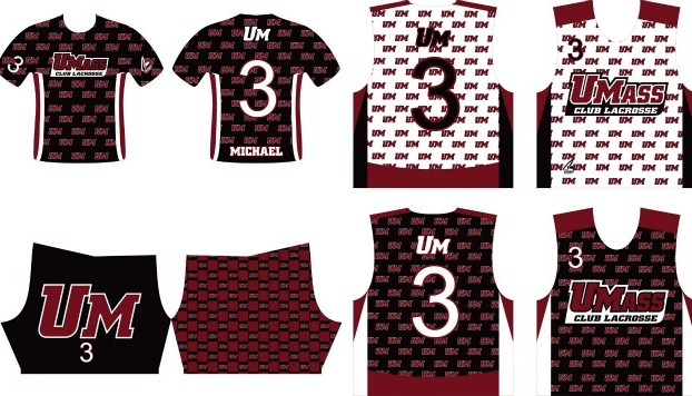
When you get to designing uniforms and pinnies, here’s a few examples of where your logo and team name are printed, and this is why it’s so important that your design elements are kept simple.